01
Marketing Design
Visuals designed to help businesses communicate their message, promote their offers, and connect with their audience.
- Social media graphics
- Advertisement creatives
- Marketing campaign visuals
- Digital promotional graphics
Marketing & Promotional Designer
I'm Wendy.
A Marketing & Promotional Designer who transforms business offers into strategic visuals that capture attention, communicate value, and drive action.
About
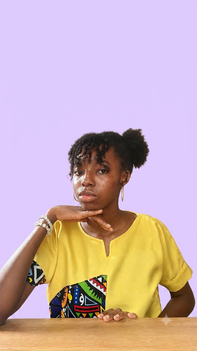
I'mWendy, a Marketing & Promotional Designer who turns business offers into visuals people notice, understand, and act on.
I create social media graphics, promotional designs, campaign visuals, and logos that help businesses communicate their value clearly and show up with intention.
Because good design isn't just about making something look good. It's about making the right message impossible to overlook.
I don't begin with design. I begin with questions.
Before creating anything, I want to understand the business, the audience, and the purpose behind the design.
Whether it's a flyer, promotional visual, campaign design, or social media graphic, I think about the goal behind the design first. The objective might be to capture attention, communicate an offer, build awareness, drive engagement, or encourage action.
Because good design isn't just about looking good.
It should have a job to do.
From a promotional flyer to a campaign visual or logo, I combine creative direction with strategic thinking to create visuals that don't just fill a space, they give your message presence.
What I Do
Visuals designed to help businesses communicate their message, promote their offers, and connect with their audience.
Attention-grabbing designs that help businesses promote products, services, events, offers, and special campaigns.
Memorable logo concepts designed to give businesses a strong and recognisable visual starting point.
Selected Work
Featured Project
Project Type
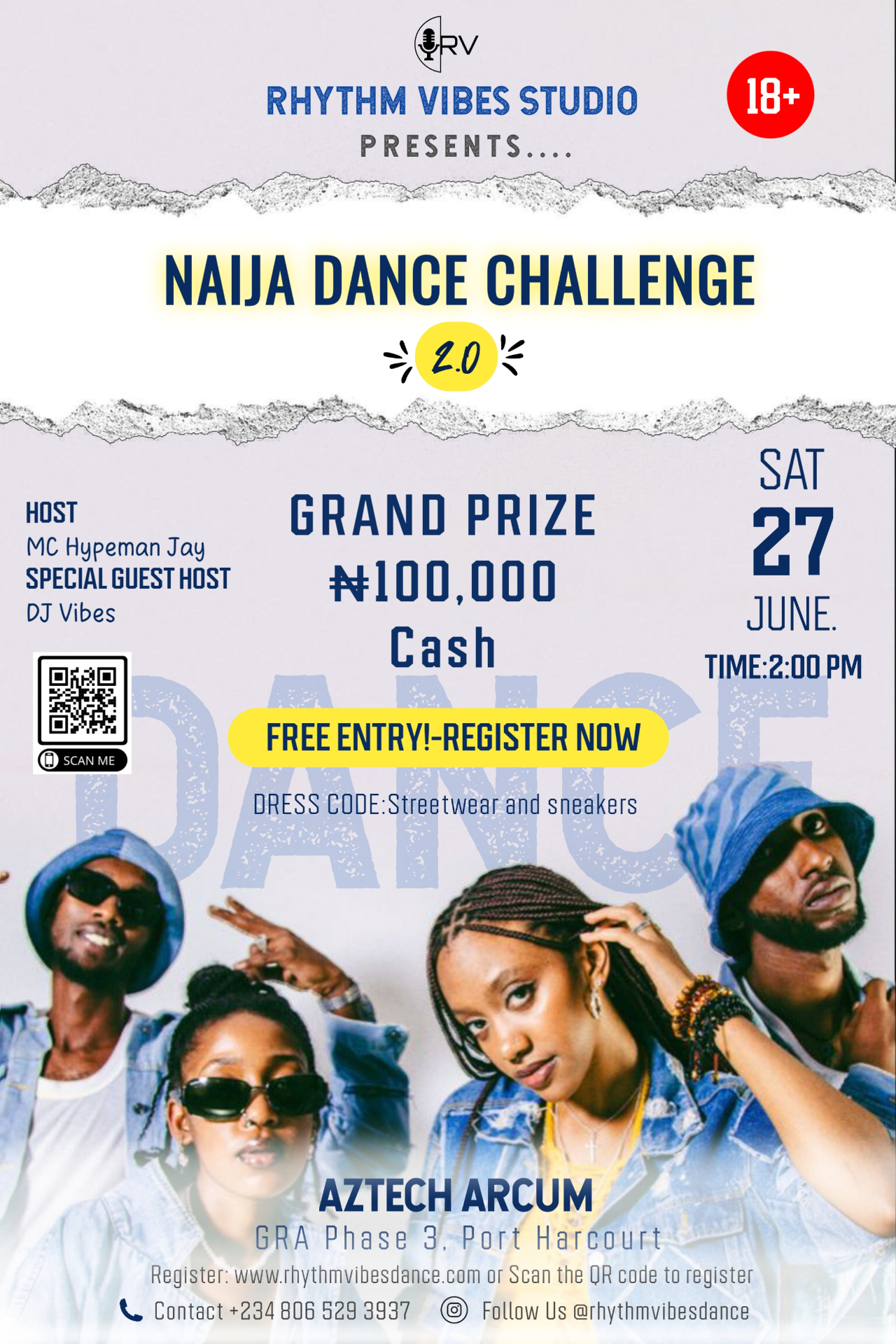
Event Promotion Flyer (Self-Initiated Design Concept)
Overview
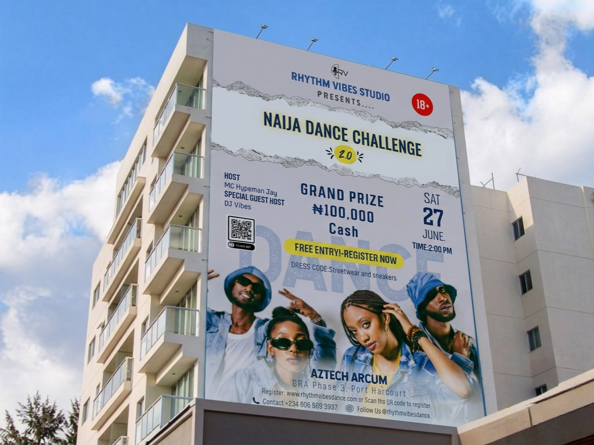
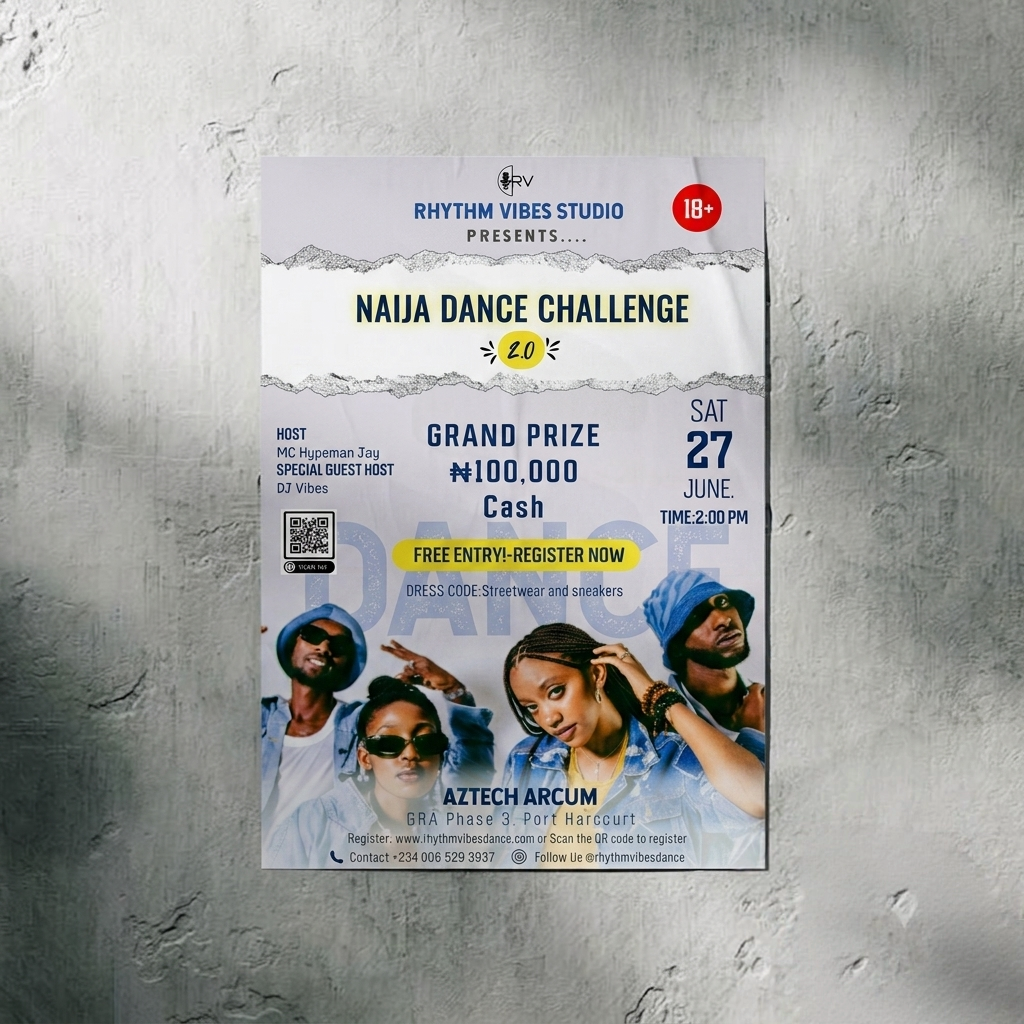
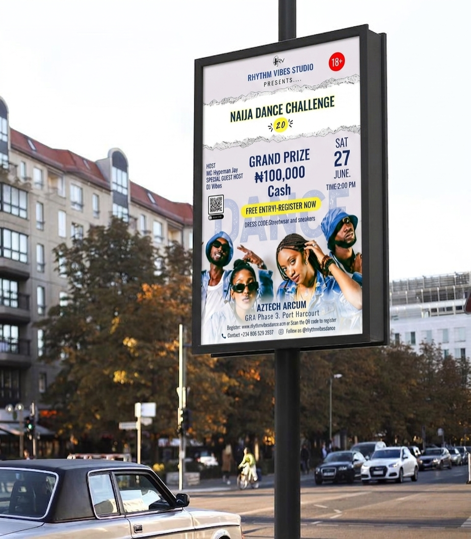
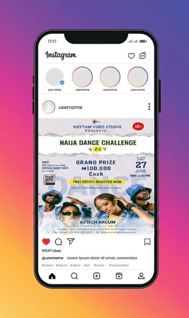
This is a design I created for a fictional dance competition aimed at grabbing the attention of young audiences through bold typography, vibrant colours, and energetic visuals. The design was created to communicate key event information while reflecting the excitement and thrill of the dance challenge.
Objective
To create a visually engaging flyer that:
Target Audience
The Challenge
The main challenge was presenting a large amount of event information without making the flyer feel cluttered. Another challenge was creating a design that looked energetic and modern while keeping important details easy to find.
Design Strategy
To solve these challenges, I:
Typography
Large condensed fonts were used for the main headline to maximise impact and readability.
Colour
Yellow was introduced to emphasise important actions and key information, while blue established a vibrant and youthful identity.
Layout
All information was grouped into sections, allowing viewers to quickly locate the prize, event details, and registration instructions.
Logo
The Rhythm Vibes logo was designed to show the energy, creativity, and emotional impact of music and live performance. At the centre is a microphone symbolising voice, expression, and performance surrounded by a semicircular form inspired by sound waves. The “RV” initials form a unified visual identity showing harmony between sound, branding, and performance.
Tools Used
Outcome
The final design delivers an energetic promotional flier that communicates essential event information while maintaining a modern and visually engaging appearance suitable for social media promotion.
Reflection
This project strengthened my understanding of visual hierarchy, typography, and layout balance. If I were to revisit it, I would refine the spacing further and explore additional ways to improve readability while maintaining the same energetic aesthetic.
Case Study
Project Type
Promotional Flyer Design (Self-Initiated Design Concept)
Overview
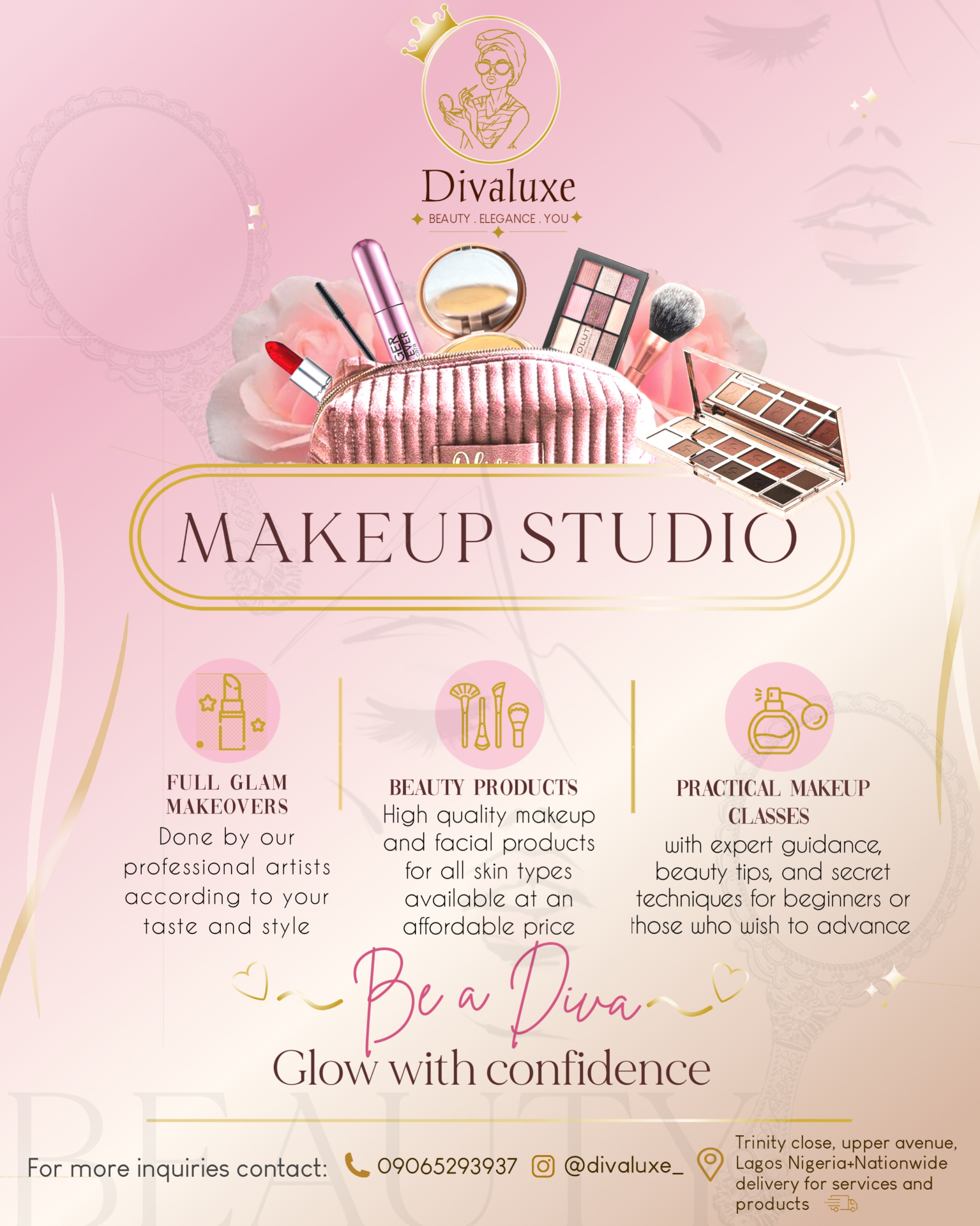
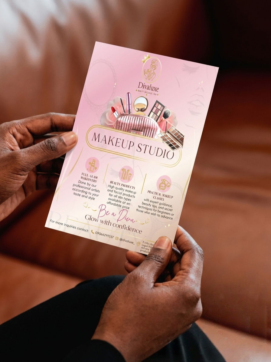
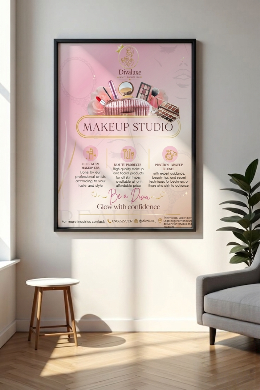
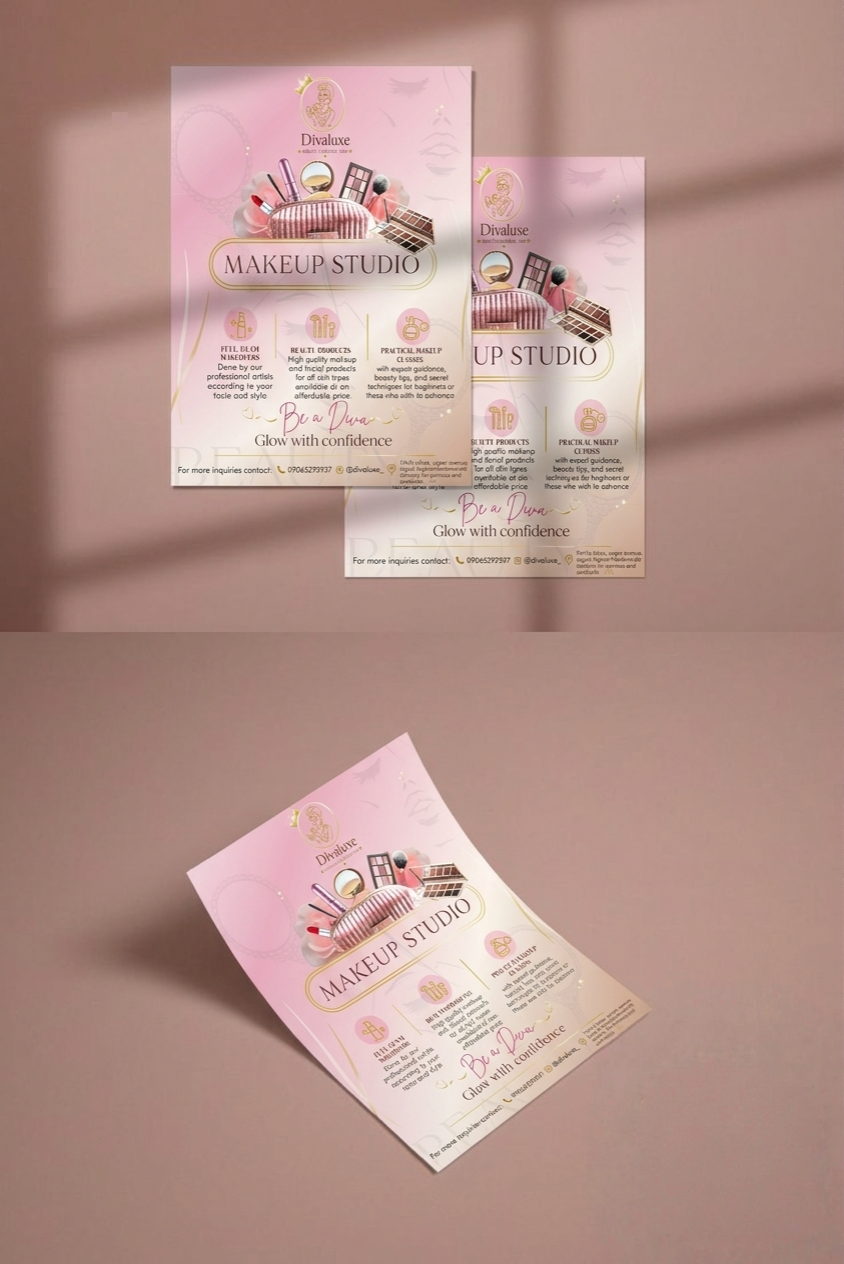
I designed this promotional flyer for a hypothetical beauty brand to showcase its makeup services, beauty products, and training classes. The goal was to achieve a feminine, elegant, and inviting design that reflects the brand's identity while communicating its offerings clearly.
Objective
Target Audience
The Challenge
The challenge was to present multiple services within one flyer while consistently maintaining a clean layout and the brand's elegant, feminine identity.
Design Strategy
To achieve this, I:
Colour
Soft pink and gold were chosen to show femininity, sophistication, and luxury.
Typography
An elegant serif typography was paired with a handwritten script to balance professionalism with personality.
Logo
For the divaluxe logo, the illustrated female figure represents the brand's focus on makeup artistry and self-expression, while the crown symbolizes luxury, excellence, and making every client feel like royalty. The circular frame creates a more balanced look, and the gold colour emphasizes the brand's premium and sophisticated identity.
Tools Used
Outcome
The final design presents Divaluxe as a modern and elegant beauty brand while making its services easy to understand at a glance. The flyer balances aesthetics with clear communication to engage potential clients.
Reflection
This project allowed me to explore luxury-inspired branding through colour, typography, and composition. If I revisited the design, I would improve text readability on smaller screens.
Case Study
Project Type
Event Promotional Flyer (Self-Initiated Design Concept)
Overview
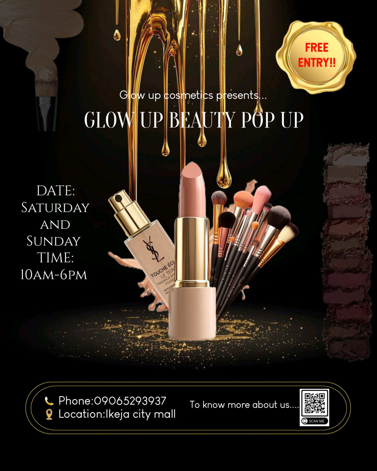
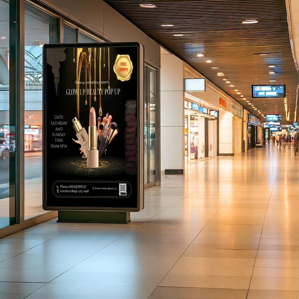
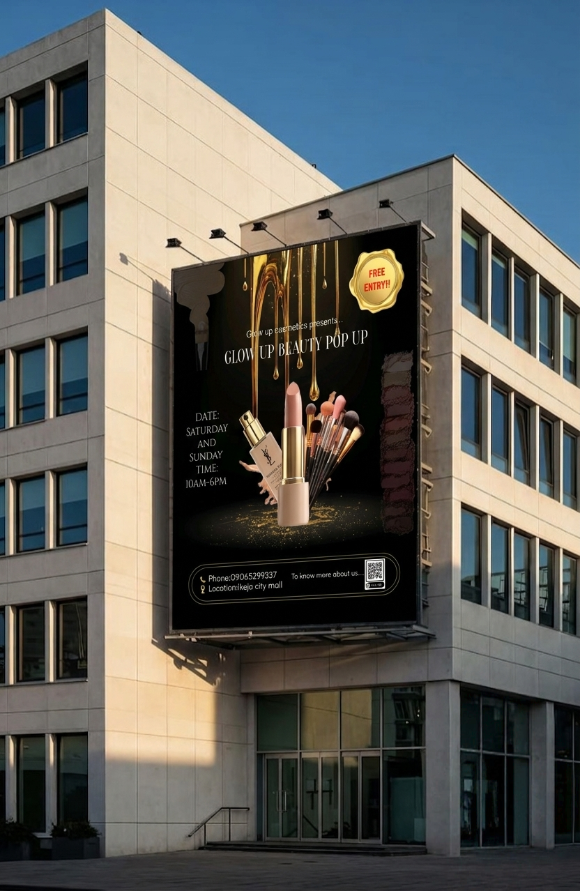
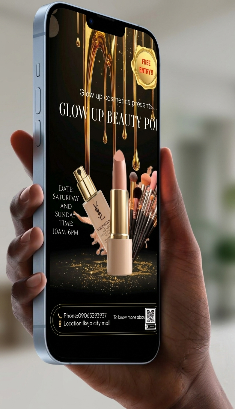
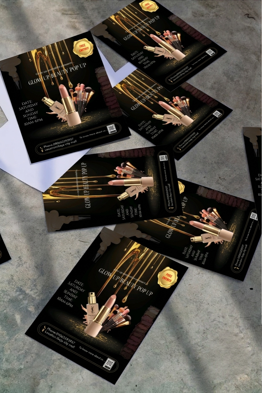
This flyer was designed to promote a beauty pop-up event where visitors could discover cosmetic products, interact with the brand, and participate in a limited-time shopping experience. The visual concept was built around luxury, glamour, and excitement to encourage attendance.
Objective
The project focused on:
Intended Audience
Challenge
The goal was to create an event flyer that felt luxurious and exciting while presenting essential event details in a way that remained visually balanced. The design needed to attract attention quickly and encourage attendance.
Design Strategy
To achieve this, I centred the composition around the featured beauty products and used lighting effects, elegant colours, and flowing decorative elements to create a premium atmosphere. The supporting information was carefully positioned to complement the visuals without distracting from the main message.
Colour Palette
A combination of black and gold was used to communicate elegance, exclusivity, and sophistication.
Typography
Bold headline typography creates immediate impact, while simpler supporting fonts maintain readability.
Layout
The products serve as the visual focal point, with event details arranged around them to maintain balance and hierarchy.
Visual Elements
Gold swirls and glowing effects were incorporated to enhance the luxurious feel and reinforce the beauty theme.
Tools Used
Outcome
The final promotional piece captures the excitement of a beauty pop-up while maintaining a clean visual hierarchy. Its bold presentation is suitable for social media campaigns, digital advertising, and event marketing.
Reflection
This project gave me the opportunity to experiment with contrast, lighting, and composition to create a visually striking promotional design. It reinforced the importance of using visual storytelling to communicate the atmosphere of an event rather than relying solely on written information.
More Work
Product promotional flyer
Grand opening promo design
Menu & services flyer
Grand opening campaign visual
Bakery services flyer
Social media brand post
Service promotional design
Personal branding layout
Social Media Design / Real Estate Advertising
Brand / Social Media Design
Graphic Design / Redesign
Original and redesign shown together.
Product Advertising / Brand Design
Why work with me
I consider what the audience needs to notice, understand, and do next before opening a canvas.
Every visual is built around the intended audience, the message, and the outcome the business wants.
Layout, typography, colour, spacing and visual hierarchy are all treated with care.
I combine creative ideas with clear communication so the design is not only attractive but purposeful.
I take time to understand the goal behind a project and stay in clear conversation throughout the process.
I keep sharpening my craft in branding, typography, and modern marketing design.
Good design isn't just visuals
It's thinking, storytelling, and intention behind every choice. I may be building my portfolio through concept and practice projects for now, but I treat every brief like a real brand challenge.
Testimonials
Client stories will live here. Available for new marketing and promotional design projects — your feedback could be the first featured.
Tools
Start a project
Whether you need a promotional graphic, campaign visual, social media design, or logo, let's turn your idea into something people notice.
Get in touch
Whether you need a marketing design, promotional graphic, social media visual, campaign design, or logo, I'd love to help you turn your idea into something people actually notice. Reach out through any of the channels below or fill out the simple form.